
Designing Better Carwash Menus
This article has been written by Mel Ohlinger
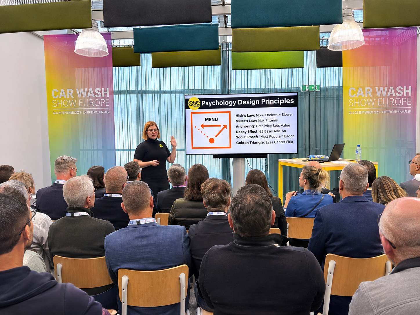
A good wash removes dirt. A good menu removes confusion.
The psychology behind car wash menus that help customers decide faster, choose better, and spend more.
When I teach this class, I start by picking up a bag of chips. I begin to open it the normal way, then stop, flip it upside down, and rip it open from the bottom. I eat a chip. Then I do the same thing to a cereal box.
The room always reacts. Some people laugh, some groan, and a few look at me like I've committed a crime. I know. I'm an abomination.
But think about it for a second. Nothing says a chip bag has to be opened from the top. Nothing stops you from flipping it over. We've simply all learned to read the top as the "right" way. That flash of what is she doing? in your head is design at work. Design influences human behavior. Once you see that clearly, you start to see your carwash menu very differently.
Design changes behavior in the wild
Some of the best examples of design shaping behavior have nothing to do with selling. They solve messy, everyday problems without a single word of instruction.
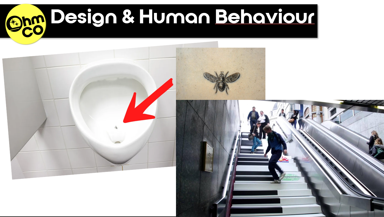
Design for hygiene: the fly at Schiphol. In the 1990s, Amsterdam's Schiphol Airport etched a tiny black fly into its men's urinals. There were no signs and no instructions, just a target. Aim improved. The airport estimated that spillage dropped by as much as 80%, and its budget for cleaning public toilets fell by about 8%. A messy problem was solved with a playful design trick.
Design for health: the piano stairs. In 2009, a Stockholm subway staircase was turned into a working piano keyboard, with each step playing a note. People laughed, filmed it, and, most importantly, chose the stairs over the escalator: 66% more people than normal. A little bit of fun changed a daily habit and encouraged healthier behavior.
Design for social reform: Banksy at the Royal Courts. In September 2025, Banksy painted a mural on London's Royal Courts of Justice: a judge with his gavel raised over a protester holding a blood-splattered placard. Officials quickly covered it with metal barriers and posted guards, then scrubbed it away. But the paint left a ghostly shadow on the wall, almost like a Grim Reaper. The attempted erasure became part of the piece, a haunting metaphor for silencing dissent. Instead of disappearing, the image sparked a global conversation.
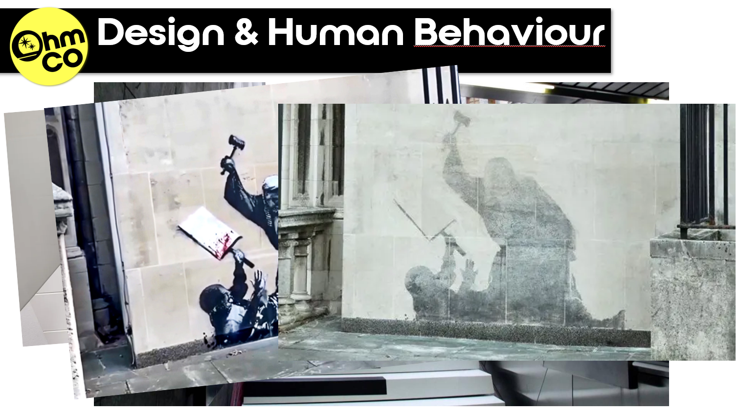
What is design psychology?
Design psychology is the study of how design (objects, spaces, graphics and systems) affects our perception, emotions and behavior. It's why some spaces make you feel calm while others make you uneasy. It's why we all open chip bags the same way, why certain menus quietly push us toward high-profit items, and why branding makes us trust some companies more than others. Three examples show how it works.
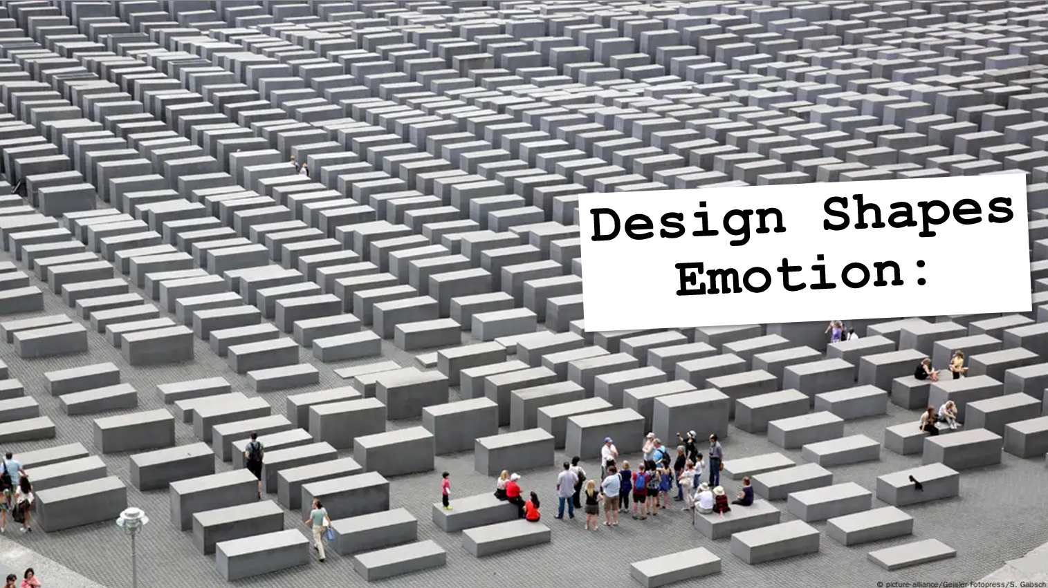
Design shapes emotion.
Walk through the Memorial to the Murdered Jews of Europe in Berlin and you feel it instantly. The tall, gray concrete slabs close in around you, swallow sound and scramble your sense of direction. You're meant to feel uneasy. That isn't decoration. It's deliberate design shaping your emotions and forcing you to confront history through disorientation.
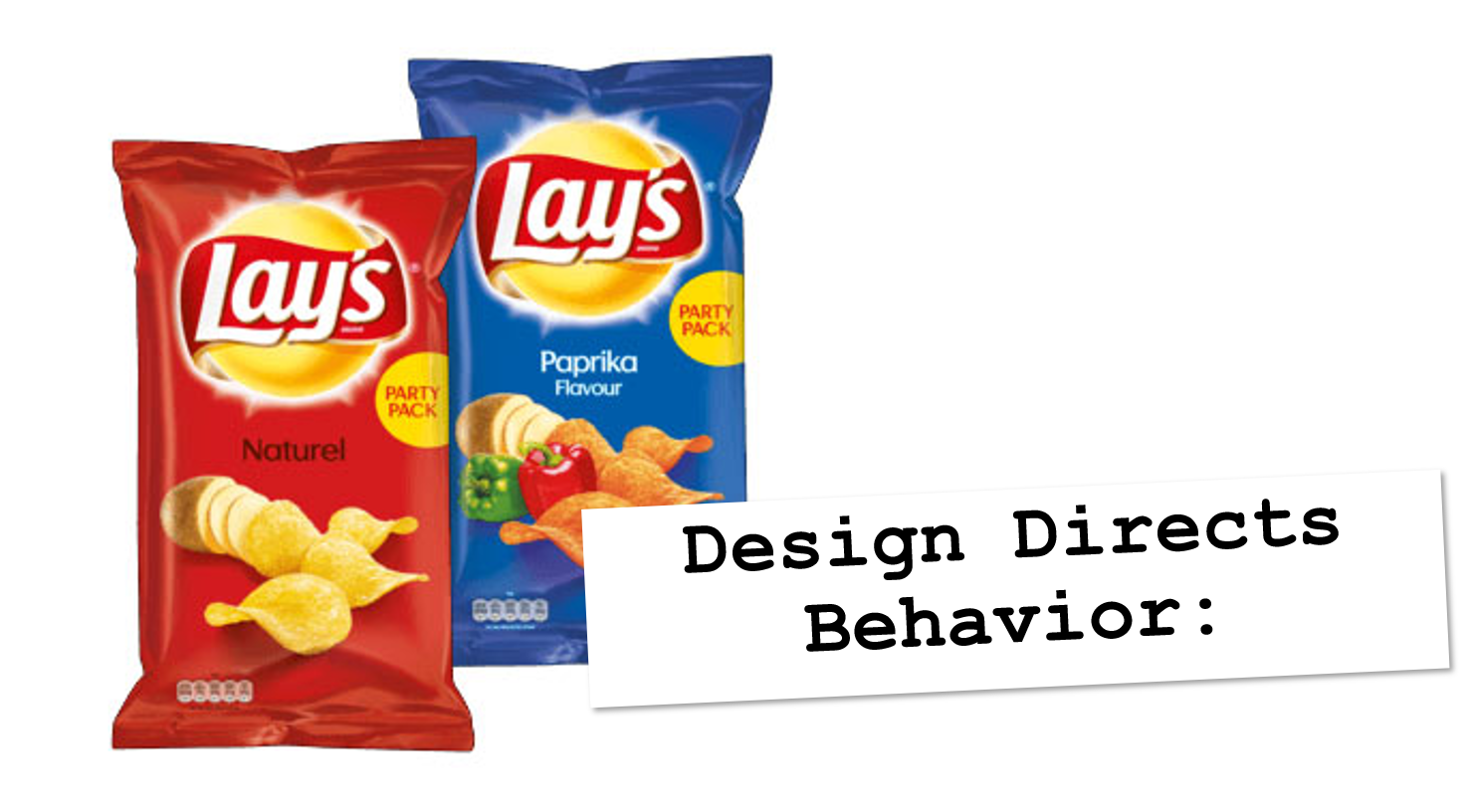
Design directs behavior. A bag of Lay's Paprika crisps, a Dutch favorite, is opened from the crimped seam at the top, where the logo sits. There are no arrows and no instructions, yet we all treat that as the "right" way. Flip the bag over and it feels wrong. Packaging has trained all of us to behave in unison without ever being told.
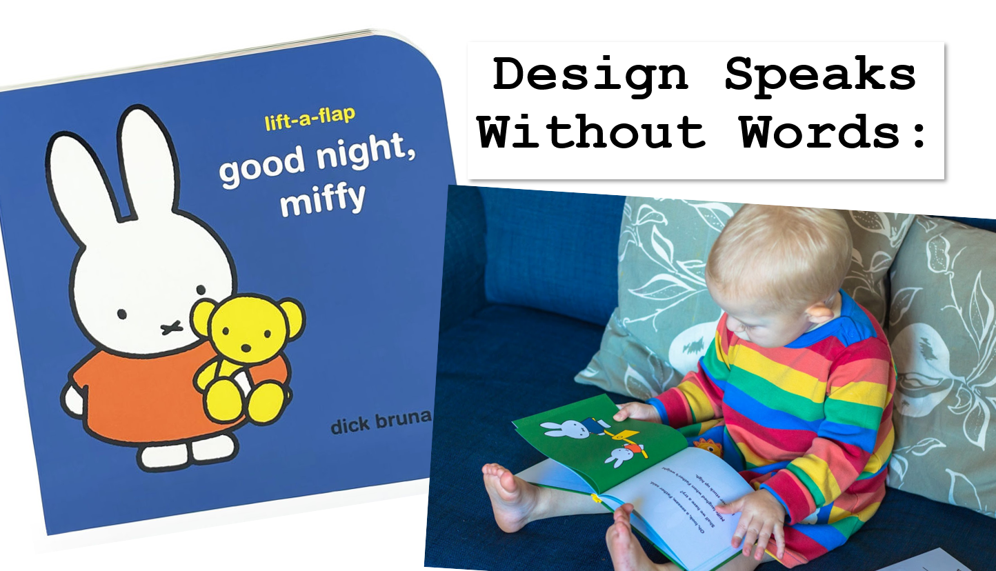
Design speaks without words. Dick Bruna's Miffy books use thick black outlines, flat colors and minimal detail, and none of it is an accident. The style is built for clarity, so children can recognize emotions instantly, fill in the gaps with their own imagination, and follow the story in any culture. It works: the books have been translated into more than 50 languages and have sold over 85 million copies. A rabbit with two dots for eyes and an X for a mouth became a universal icon because of design.
The question isn't whether design influences behavior. It does. The question is how we harness it at the carwash to boost sales, speed up decisions and improve the customer experience.
Your menu is a behavior tool
As we all know, the carwash menu is not just decoration. It decides whether customers choose the cheapest wash, the middle wash or the premium wash. It decides whether they hesitate and hold up the line, or press the button with confidence. If you let your menu design happen by accident, you're leaving money on the table. Here's the psychology toolkit that applies directly to the pay station.
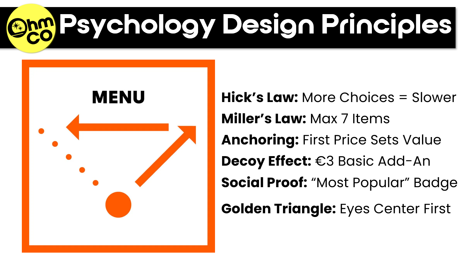
Hick's Law: more choices mean slower decisions. In 1952, psychologist William Hick showed that the time it takes to make a decision grows with every option you add. At a pay station, every extra second of hesitation slows the whole line, and a confused customer usually defaults to the cheapest wash. Offer three packages, not four or five. Three is enough to show a clear step up in value without making anyone stop and study the board.
Miller's Law: the brain can only hold so much at once. George Miller's famous 1956 paper put the limit of short-term memory at about seven items, and later research suggests the real number is closer to three or four. Either way, a customer can't compare 12 features across four washes from the driver's seat. Keep each package to 3–5 features, and pick the ones customers actually care about: clean, shine, protection.
The Golden Triangle: where the eye lands first. Menu designers have long held that eyes go to the center of a menu first, then up to the top right, then across to the top left. That center spot is prime real estate, so it's where your premium wash belongs. One caveat: a 2012 eye-tracking study found diners often read menus in order, like a book. Treat the triangle as a starting point, and test your layout at your own wash.
Anchoring: the first price sets the reference. Psychologists Amos Tversky and Daniel Kahneman showed in 1974 that the first number people see shapes how they judge every number after it. If your top wash costs €20 and that's the first price a customer reads, the €14 middle wash suddenly feels reasonable. Lead with premium, so every other price is measured against it.
The Decoy Effect: a slightly worse option makes the better one look smarter. Researchers found in 1982 that adding an option that is clearly inferior to another, but close in price, pushes people toward the better option. On a carwash menu, that means adding a "Basic + Wax" for €3 more than your true basic. Few people will buy it. Its job is to make the step up to your middle or premium package look like the obvious deal.
Social Proof: people trust the herd. When we're unsure, we look at what other people chose. Robert Cialdini made this one of his six principles of persuasion, and a restaurant chain in Beijing saw orders for dishes labeled "most popular" rise 13–20%. A small "Most Popular" badge on your middle package does the same thing at the pay station: it takes the risk out of the decision and cuts the hesitation.
Restaurants have been doing this forever. Menu engineers report that highlighting one dish, with a box or a single photo, can lift its sales by as much as 30%. That's not food quality. That's design.
Restaurant tricks that translate
A few small moves from restaurant menus work just as well on a carwash board:
- Drop the currency sign. Write "20", not "€20". In a Cornell study, diners spent about 8% more when prices appeared without a currency sign.
- Lose the decimals. "20" reads lighter than "20.00".
- No dotted lines to prices. Those leader dots drag the eye straight to the numbers and turn your menu into a price comparison.
- Refresh your visuals every 6–12 months. Familiar becomes invisible. Regulars stop reading a board they've seen a hundred times.
Little nudges, big impact, just like the fly in the urinal.
If this all sounds like a lot of effort for a wash menu, consider Piet Zwart. In the 1920s, the Dutch designer took a cable company's catalog, full of wires, cords and technical specs, and turned it into a modernist masterpiece of bold color and asymmetry. If design can make cables compelling, it can make your soap irresistible.
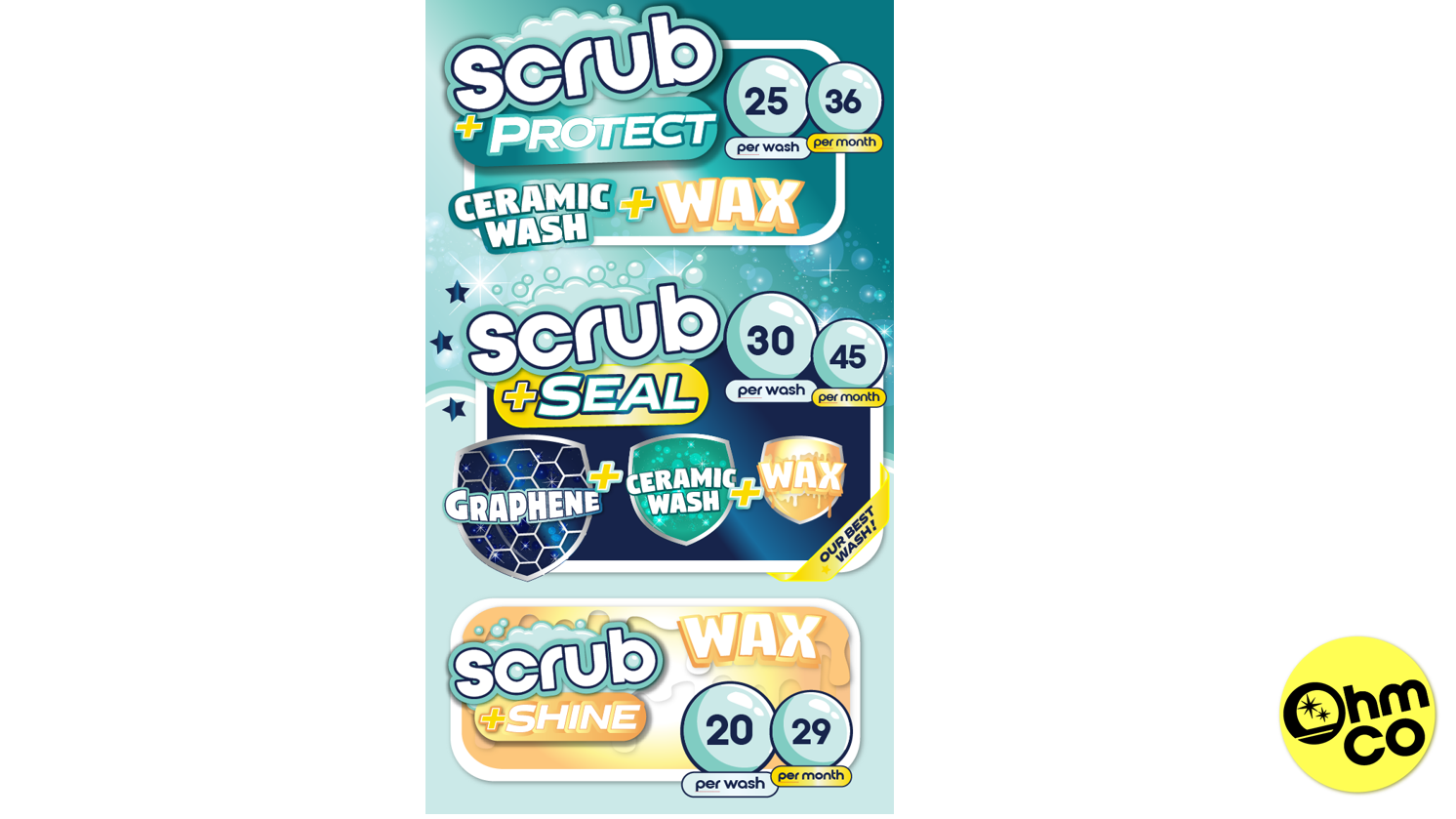
What the perfect menu looks like
Put the principles together and you get a simple formula:
- Three options only: Basic, Middle and Premium.
- Premium at eye level: bold and simple, in the center of the golden triangle.
- Middle at the top, labeled "Most Popular."
- Basic second-to-last, with the "Basic + Wax" decoy just below it.
- Icons, not paragraphs. A droplet, a sparkle, a shield.
- Three to five features max per package.
- Large fonts and high contrast. Nobody should have to squint from the driver's seat.
- Consistent branding. Your board, rack card and website should all match.
- Stacked pricing for memberships, so the value of each tier is obvious at a glance.
The same rules hold whether your menu is printed, on an outdoor TV or on an LED screen: fewer choices, clearer hierarchy, bigger type.
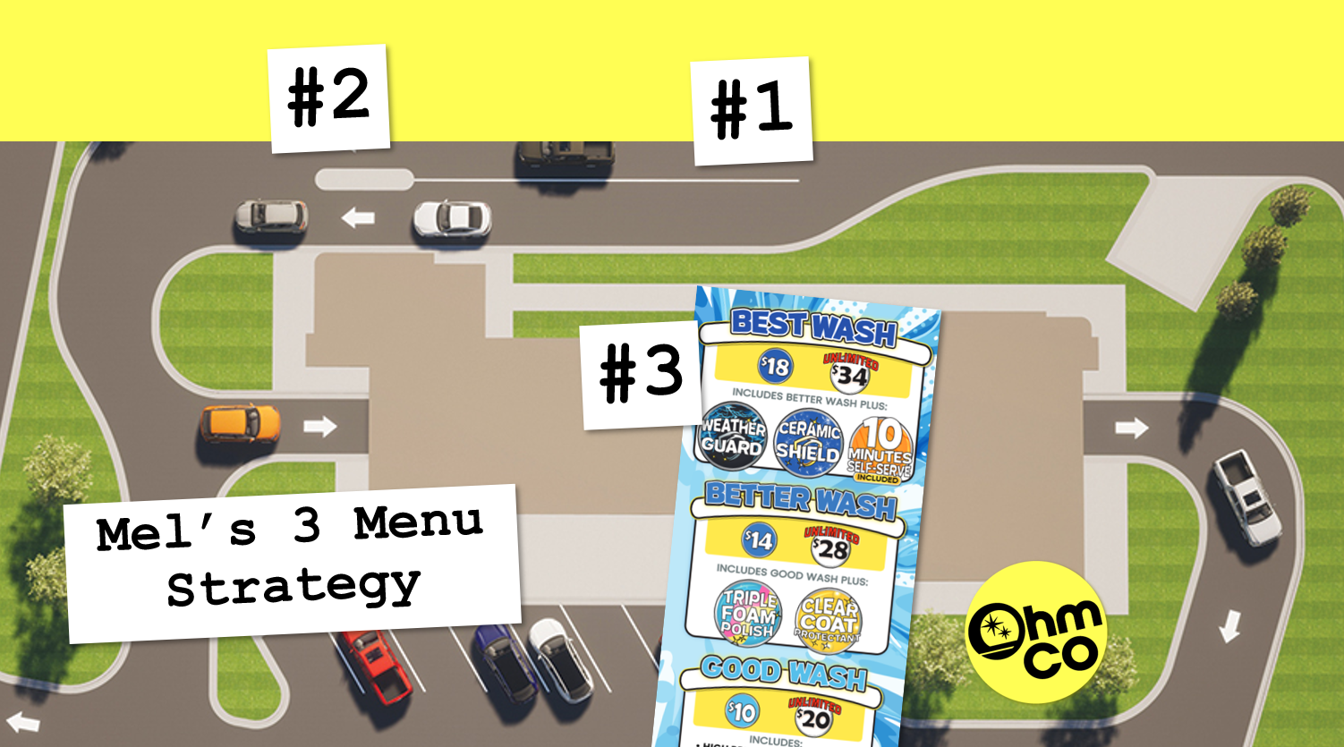
Mel's 3 Menu Strategy
One menu can't do every job. Customers meet your pricing at three moments, and each moment needs its own design.
Menu 1: the pre-menu. The first menu sits about three cars back from the pay station, where drivers are waiting with nothing to do but look. This is where the decision really starts, so keep it simple: big icons and short benefit lines, like Basic: Clean & Rinse, Deluxe: Shine & Protect, and Ultimate: Long-Lasting Finish. The pre-menu's job is to plant the premium anchor early. By the time customers reach the pay station, they've already pictured that long-lasting finish on their car.
Menu 2: the main menu. At the pay station, the customer has seconds, not minutes, and there may be a line behind them. The main menu should be the easiest thing on the lot to read: icons with one- or two-word labels, and your premium wash dead center in the golden triangle. Its job is a fast, confident decision, nudged upward. Anything that makes a customer stop and study the board costs you time and usually costs you the upsell.
Menu 3: the rack card. The rack card is the only menu customers take with them. It rides in the glovebox, comes into the house, and sometimes gets handed to a friend. Because it's read slowly, it's the place for more detailed benefits, and it's where memberships go at the top. The rack card's job is persuasion over time, turning a one-time visitor into a member.
Menus at the pay station are read in seconds. Rack cards are read at home and sometimes shared with friends. Different designs, same goal: guide behavior.
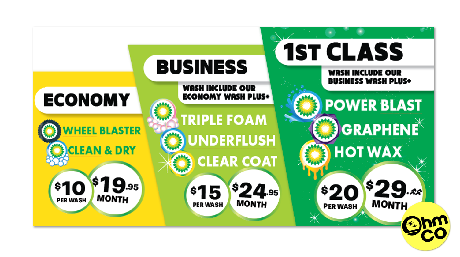
The 30-day challenge
Don't take my word for it. Test it.
- Pick one location.
- Switch it to the three-tier, golden-triangle design.
- Track sales mix, average ticket and decision time for 30 days.
- Compare the results to your baseline.
The math adds up fast. Even €2 more per average ticket, across 100,000 cars a year, is €200,000. That's not theory. That's a measurable result.
Design isn't decoration
From memorials that make us feel uneasy to picture books that comfort children with bold, simple shapes. From chip bags that tell us the "right" way to open them to carwash menus that quietly steer us toward premium. From a fly in a Schiphol urinal to piano stairs in Stockholm, and the shadow of a Banksy mural haunting a wall in London. Design isn't decoration. It's communication. It tells our brains what to do and shapes what we choose, how we feel and how much we spend.
Used with intention, it isn't manipulative. It's generous. You're making decisions easier, guiding customers toward value and lifting your business at the same time. Design influences human behavior, every single time. So make a few new versions of your menu and watch what happens to your bottom line. And if you still open your cereal box from the bottom after reading this, you're welcome.
Sources
Psychology principles
- Hick's Law: W. E. Hick, "On the rate of gain of information," Quarterly Journal of Experimental Psychology, 1952
- Miller's Law: G. A. Miller, "The magical number seven, plus or minus two," Psychological Review, 1956
- The later "three or four items" estimate: Steven Pinker's obituary of George Miller, American Psychologist, 2013
- Anchoring: A. Tversky and D. Kahneman, "Judgment under uncertainty: heuristics and biases," Science, 1974
- Decoy effect: J. Huber, J. Payne and C. Puto, "Adding asymmetrically dominated alternatives," Journal of Consumer Research, 1982 (summary)
- Social proof and the Beijing "most popular" study (13–20%): Vator, citing Peking University and Duke University research; R. Cialdini, Influence: The Psychology of Persuasion, 1984
- Golden triangle and the 2012 eye-tracking study: Gizmodo, "How to read a menu the scientific way"
Menu tricks
- No currency sign (about 8% more spent): Cornell Chronicle and the full study by Yang, Kimes and Sessarego, 2009
- Highlighting one item (up to 30%): WebstaurantStore, "Menu psychology"
Examples
- Schiphol urinal fly (spillage down as much as 80%, cleaning budget down about 8%): The Decision Lab
- Piano stairs, Odenplan station, Stockholm (66% more stair users): DDB Stockholm / The Fun Theory
- Banksy at the Royal Courts of Justice, September 2025: Artnet News
- Memorial to the Murdered Jews of Europe: Foundation Memorial to the Murdered Jews of Europe
- Miffy (50+ languages, 85 million copies): PBS NewsHour
- Piet Zwart's NKF cable catalog, 1927–28: Letterform Archive
The €200,000 figure is simple arithmetic: €2 × 100,000 cars.
Mel Ohlinger is the CEO of
OhmCo, a carwash marketing agency in Neenah, Wisconsin that specializes in graphic design and carwash websites. The name is simple: "Oh" for Ohlinger, "M" for Mel and Mike, and "Co" for company.